Libby
Mobile • Book Club • UX Redesign • Case Study
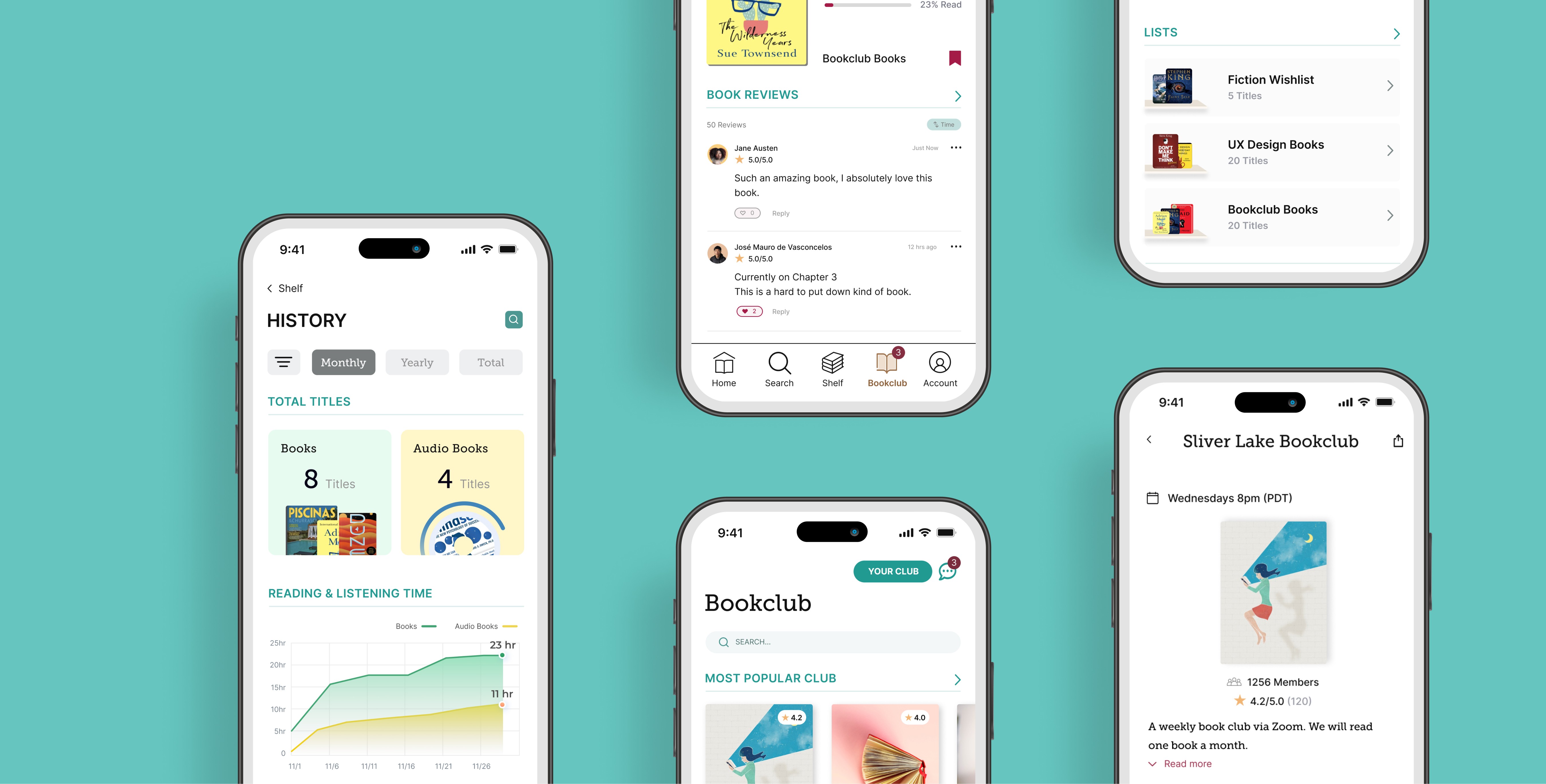
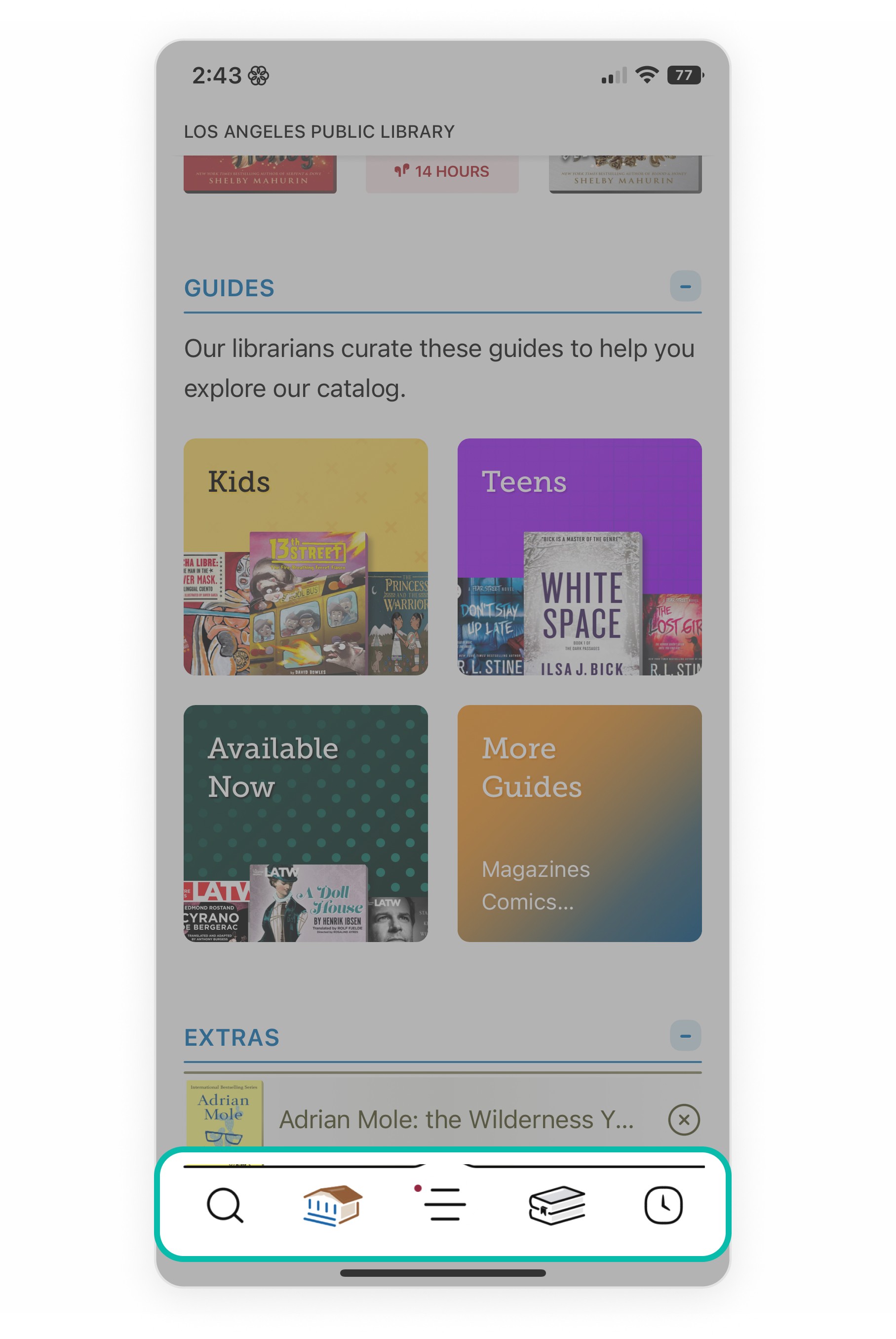
Difficult to navigate
Lack of features
Unconventional menu
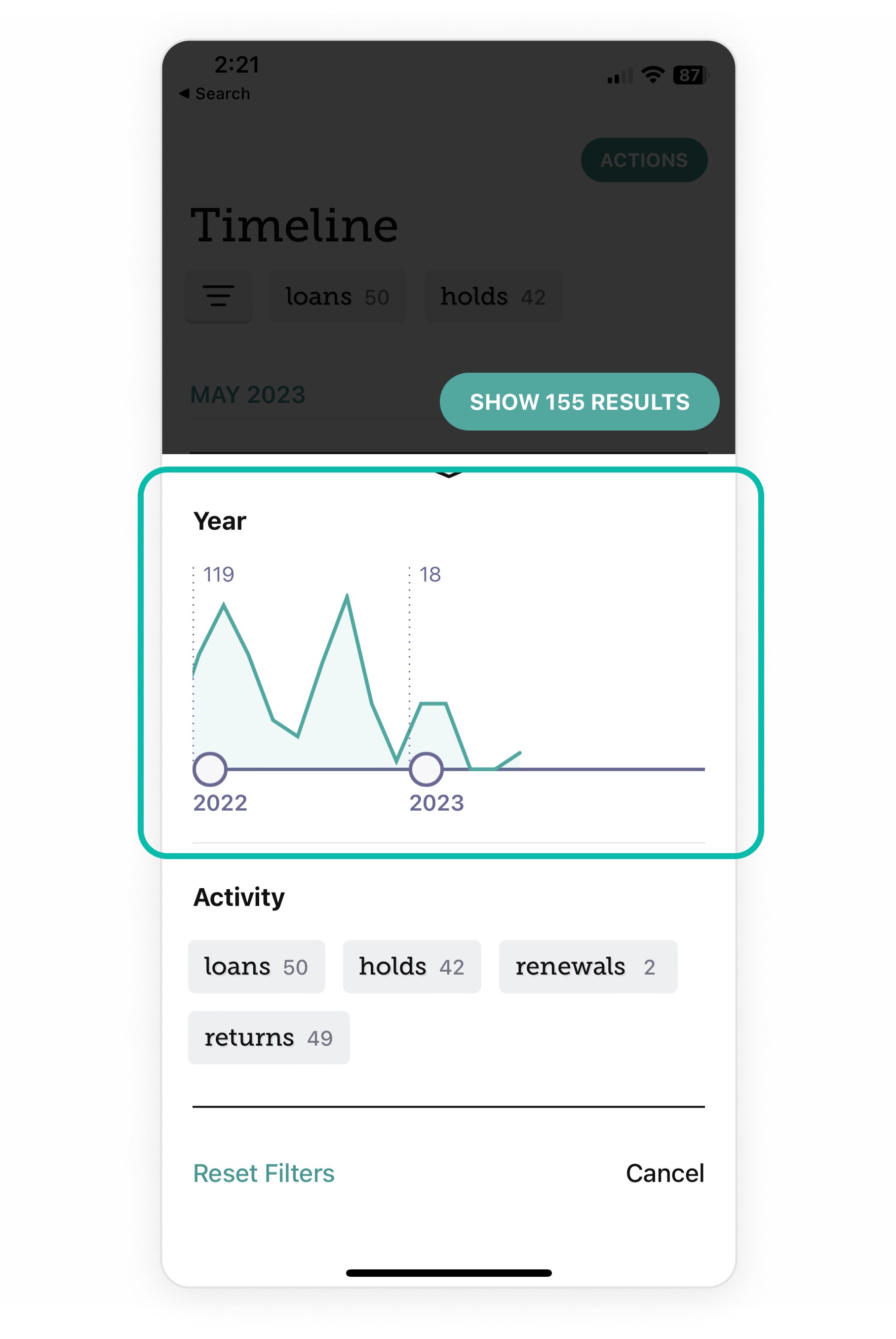
Difficult to navigate book journey
Book history feature lacks depth
SOLUTIONS
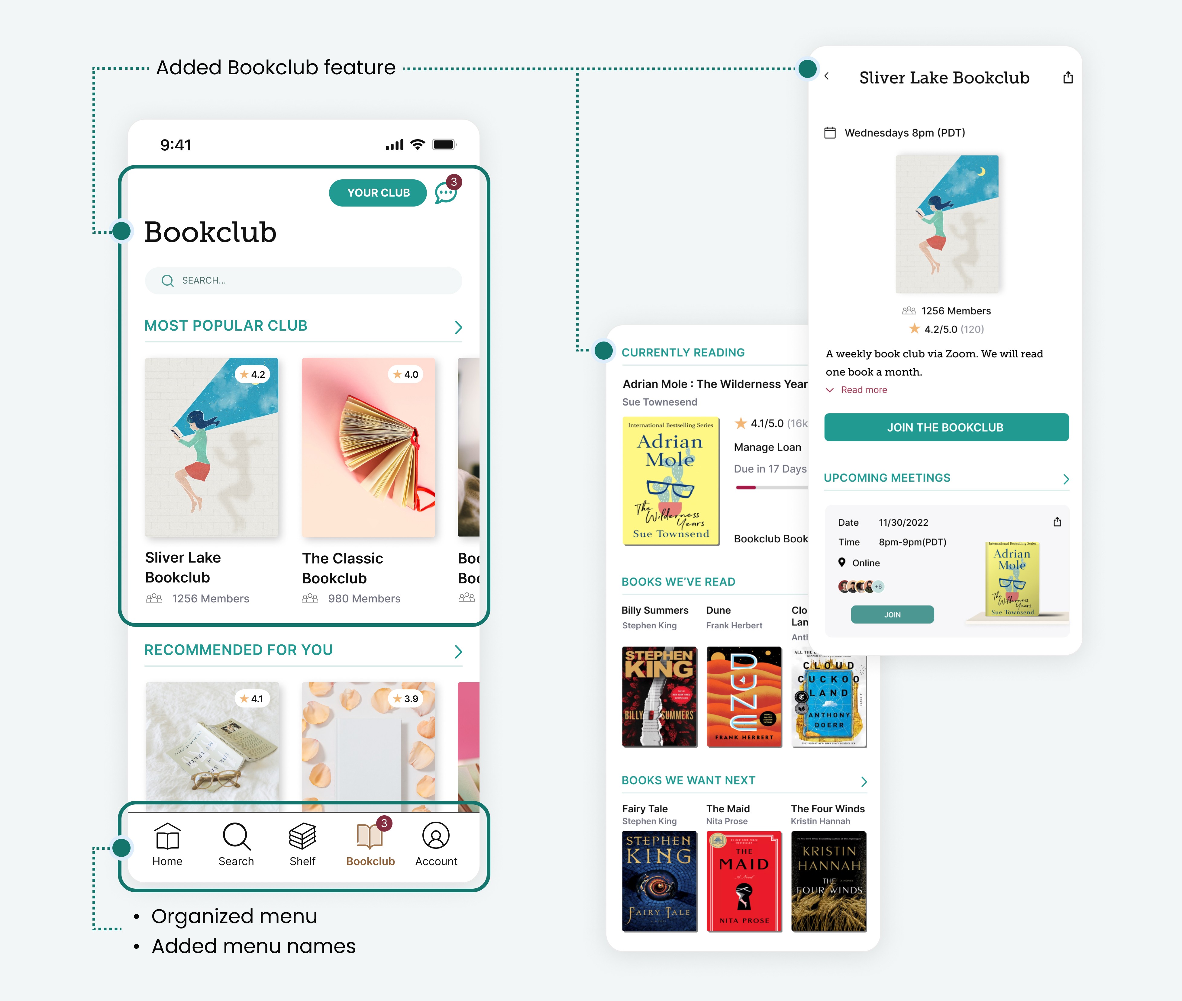
Organized menu & added the new Bookclub feature
Reorganized the existing menu items.
Labeled menu names to enhance user understanding.
Created a new Bookclub feature that allows users to share their activity with friends and community, which ultimately increases user engagement.
The visual representation of book history features
Redesigned the book history navigation to ease accessibility.
Enhanced the book history feature by incorporating visual charts to track progress and history.
Request to add a title feature
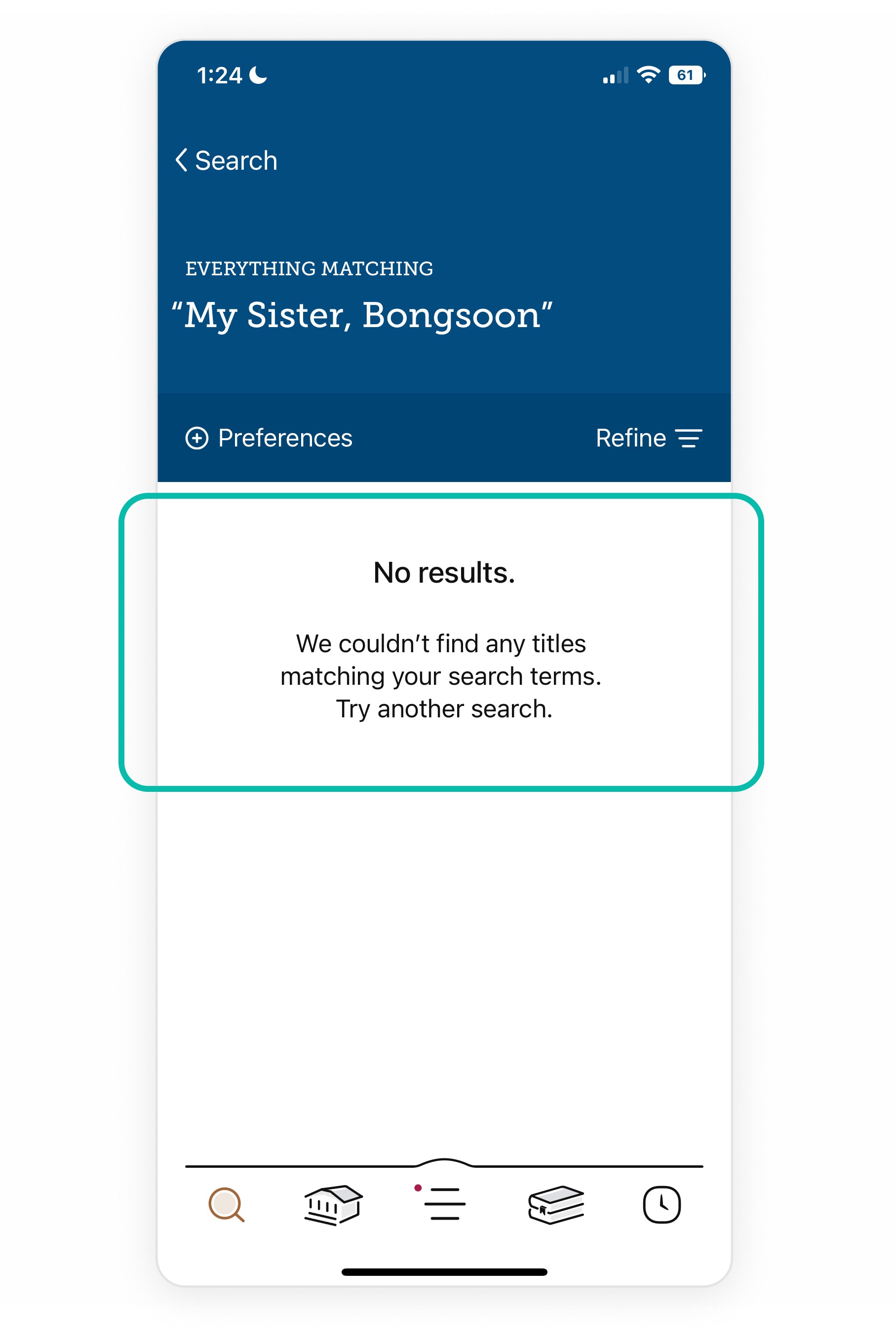
I added a feature that allows users to send a request to add a title directly to Libby from the search window if the desired book is not found.
DESIGN PROCESS

1 UNDERSTANDING THE PROBLEMS
Immersion
Secondary research
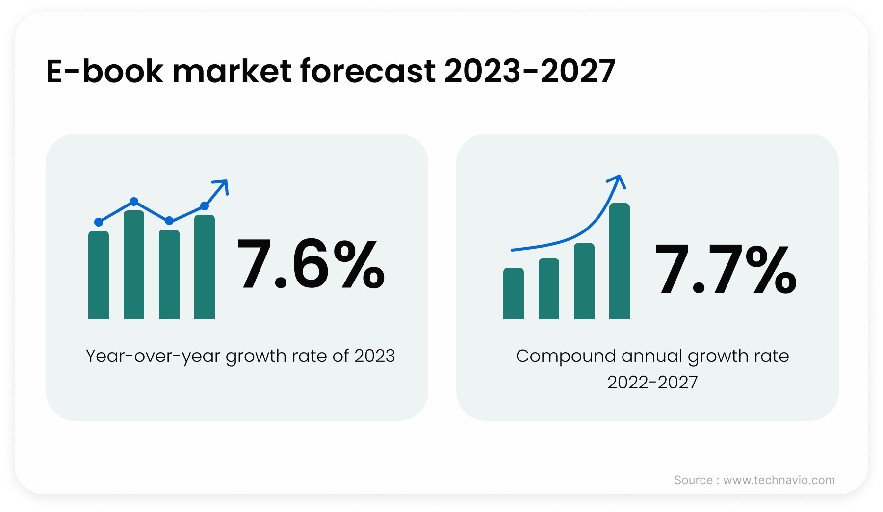
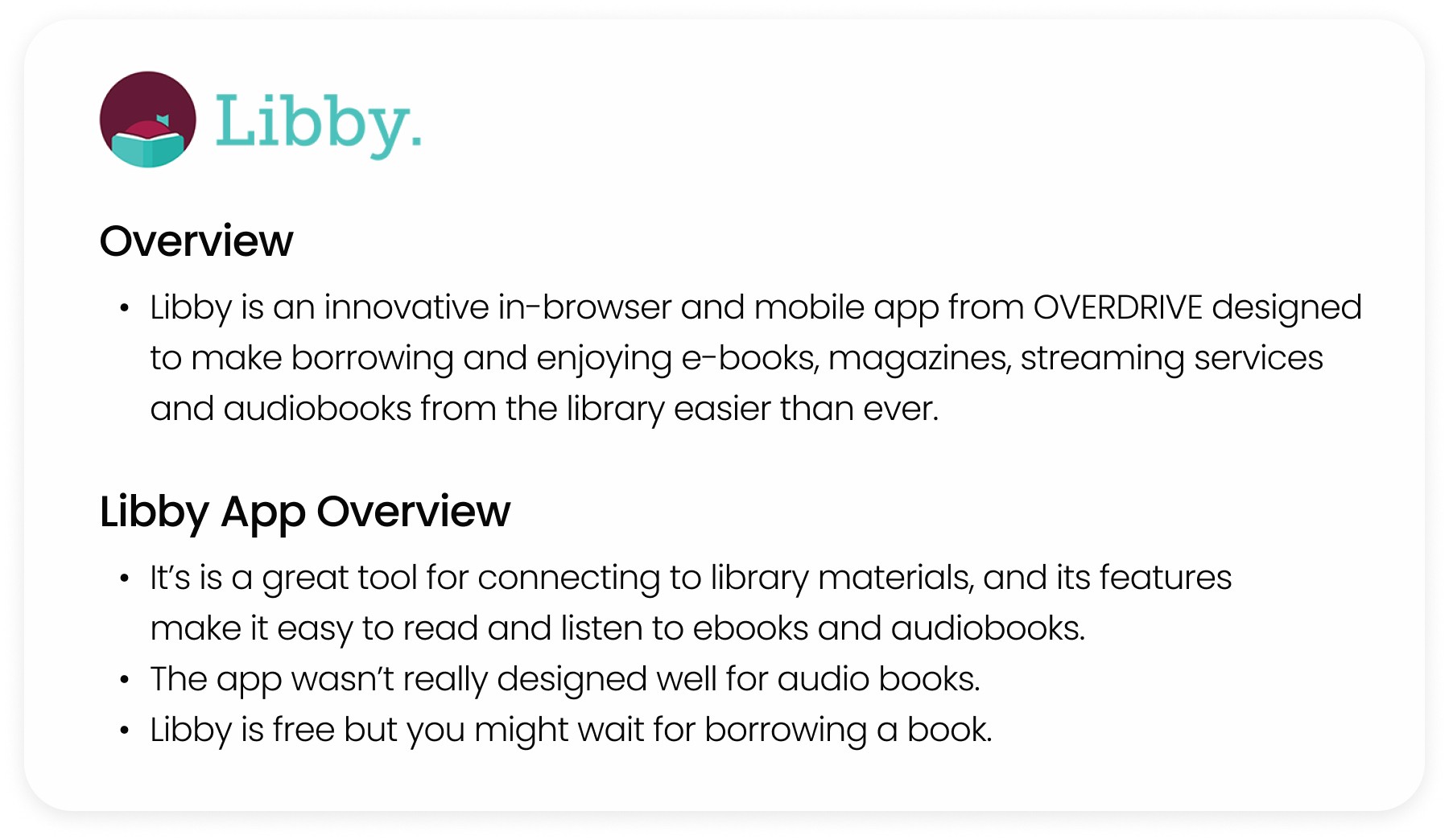
Through my research on the ebook market, I discovered that the market is experiencing continuous growth. Additionally, I conducted general background research on Libby, including when it was founded, its operations, and prospective growth opportunities.
Competitor analysis
After evaluating the mobile apps and user experiences of Hoopla, Scribd, Audible, and Kindle, I have assessed their similarities and differences in relation to Libby.
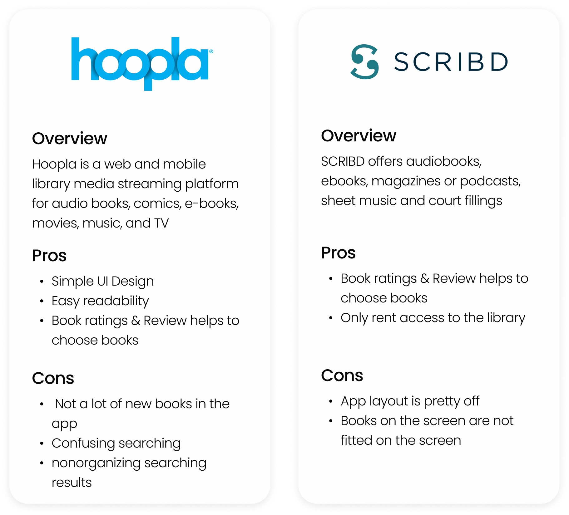
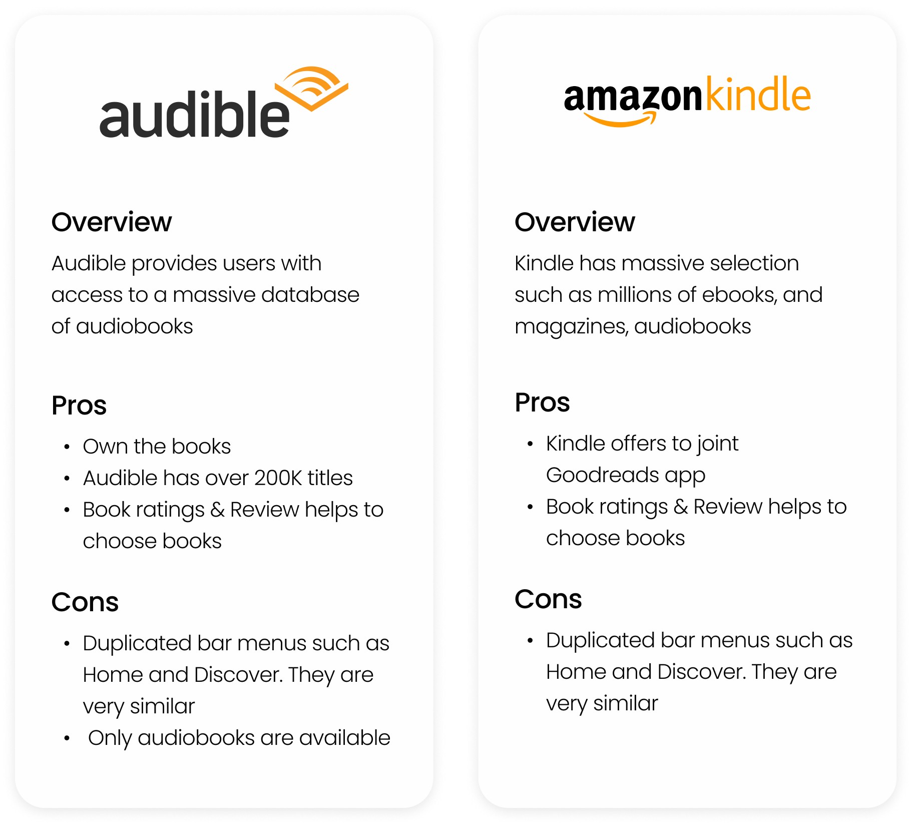
Researching app reviews
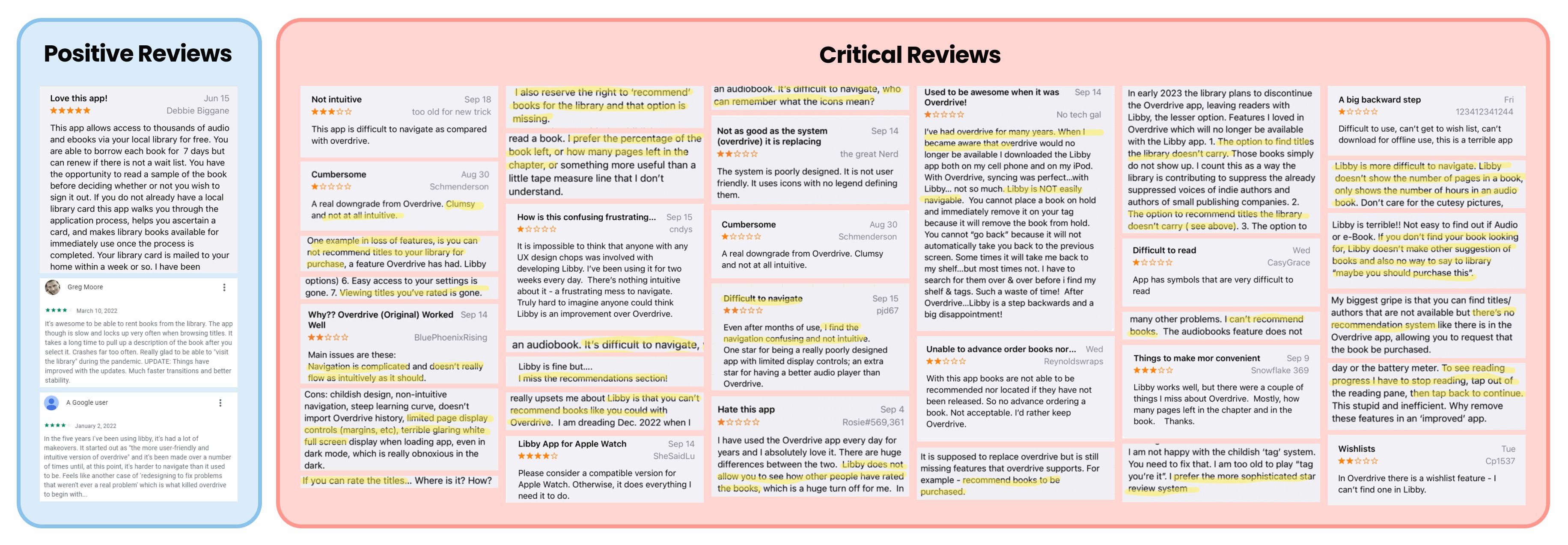
After analyzing the features of these four competing apps, I analyzed user reviews of Libby on the App Stores. I categorized these comments into positive and critical feedback to create a clear visualization of areas where Libby should maintain its strengths and areas that require improvement.
Interview takeaways
The interview process provided me with diverse perspectives and insights beyond my own. It broadened my understanding of user needs and allowed me to address key issues and challenges in the redesign project.
Participants: 5 (3 females, 2 males)
Age: 20 - 60
Duration: 30 - 40 mins
3 Offline interviews - 1 Zoom, 2 in-person interviews

Affinity mapping
I used an Affinity Map to profile Libby's users. This provided a comprehensive view of user needs and problems. By identifying patterns and preferences, the map assisted my design decisions to enhance their experience.

Problem statement & opportunity
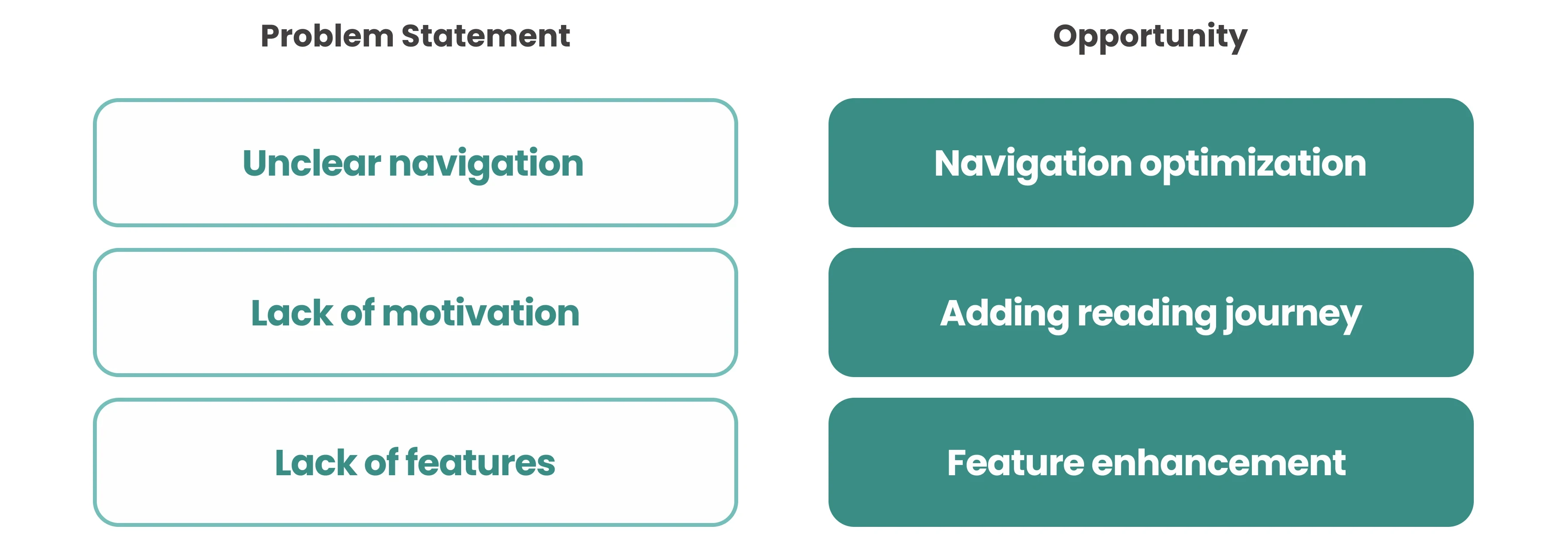
After analyzing user data and insights, I discovered several issues and challenges that the Libby app users face. I used this information to develop ideas aimed at redesigning the app and overcoming these obstacles, thus ensuring a better user experience.
Insight
Users wanted the ability to track their reading progress and derive motivation from their accomplishments.
They expressed a desire to share book reviews with others.
2 Ideate solutions
Ideation
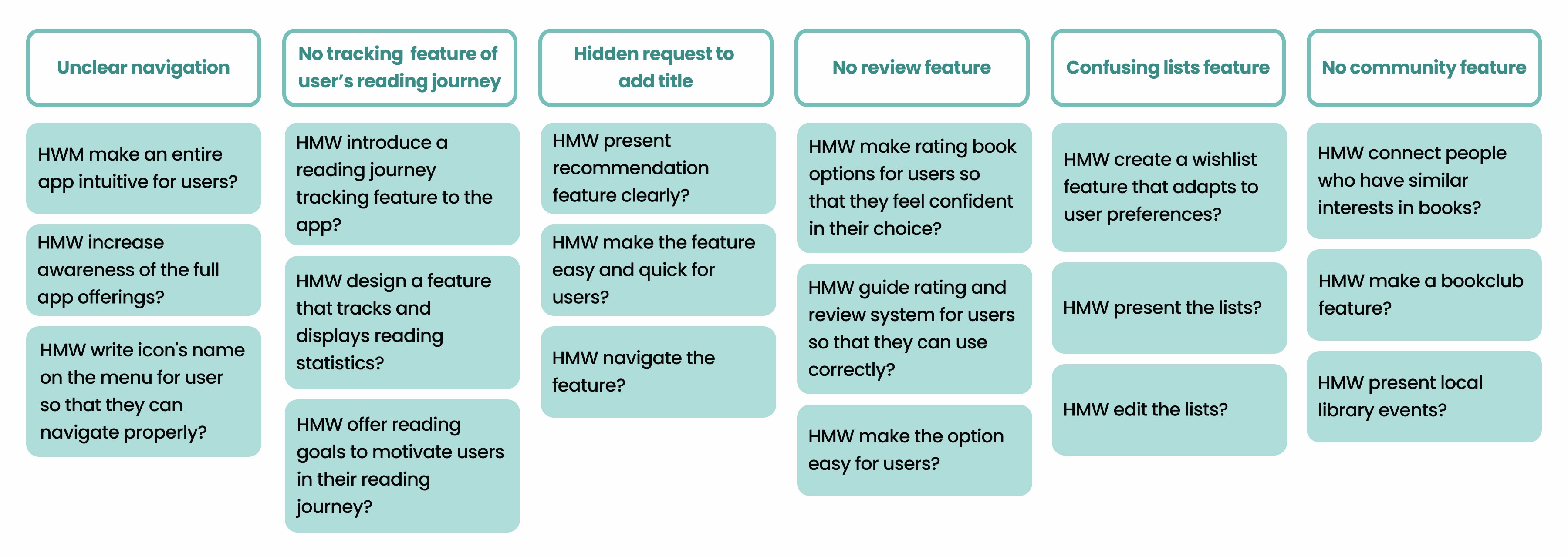
HOW MIGHT WE (HMW)
By utilizing the empathy map, we were able to identify key issues and explore various viewpoints to find solutions. Our main objective was to create a user-centric design, and we formulated HOW MIGHT WE (HMW) statements. These statements helped us generate effective ideas for addressing the identified problems.
Priority feature (2x2 matrix)
I utilized the data to generate ideas and employed a 2x2 matrix to prioritize features, placing emphasis on functionalities that offer significant value to users while requiring minimal effort, all aimed at enhancing the user experience.

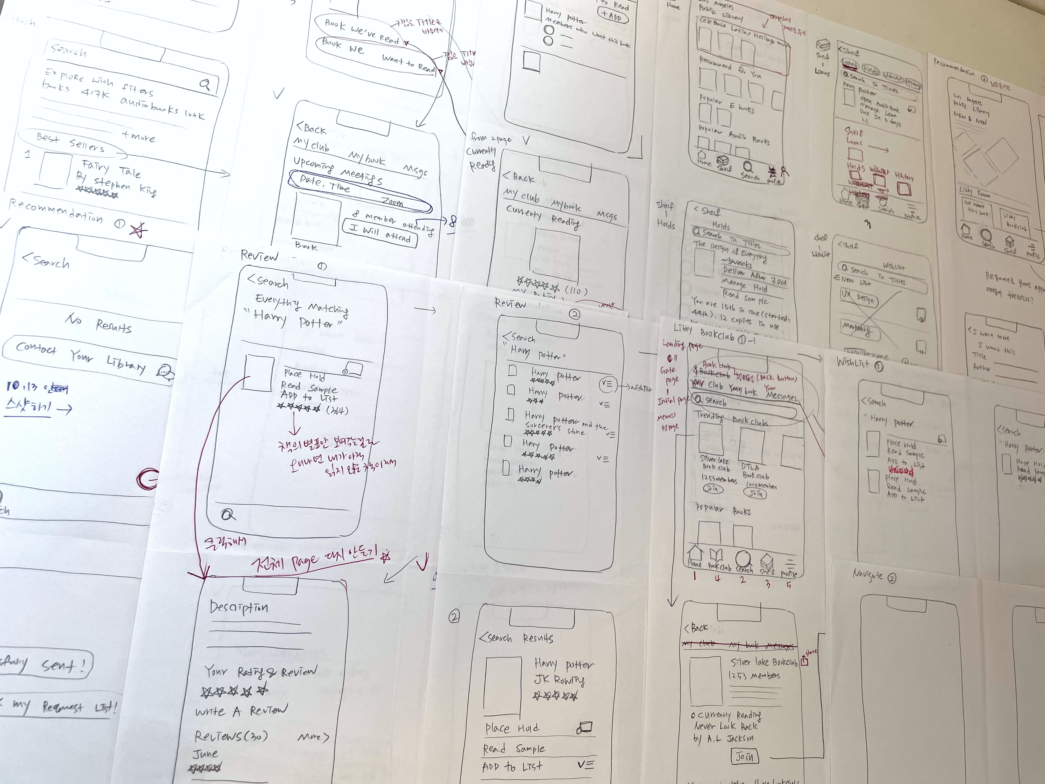
Sketch - crazy 8's
Here are the initial sketches that I prepared before designing the high-fidelity prototype. I created multiple design ideas and drew them to explore different possibilities.
3 REPRESENTING LIBBY
Prototyping
Mid-fidelity prototype
Based on the sketches, I created wireframes of redesigned features.
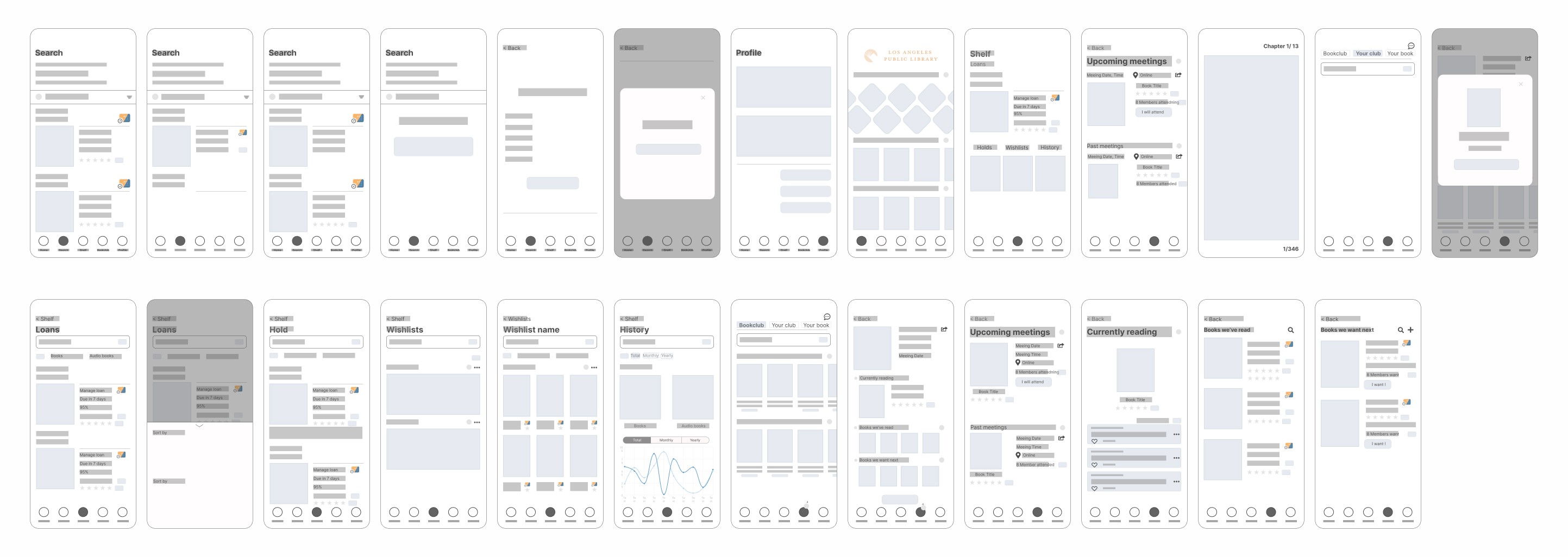
Feature overview
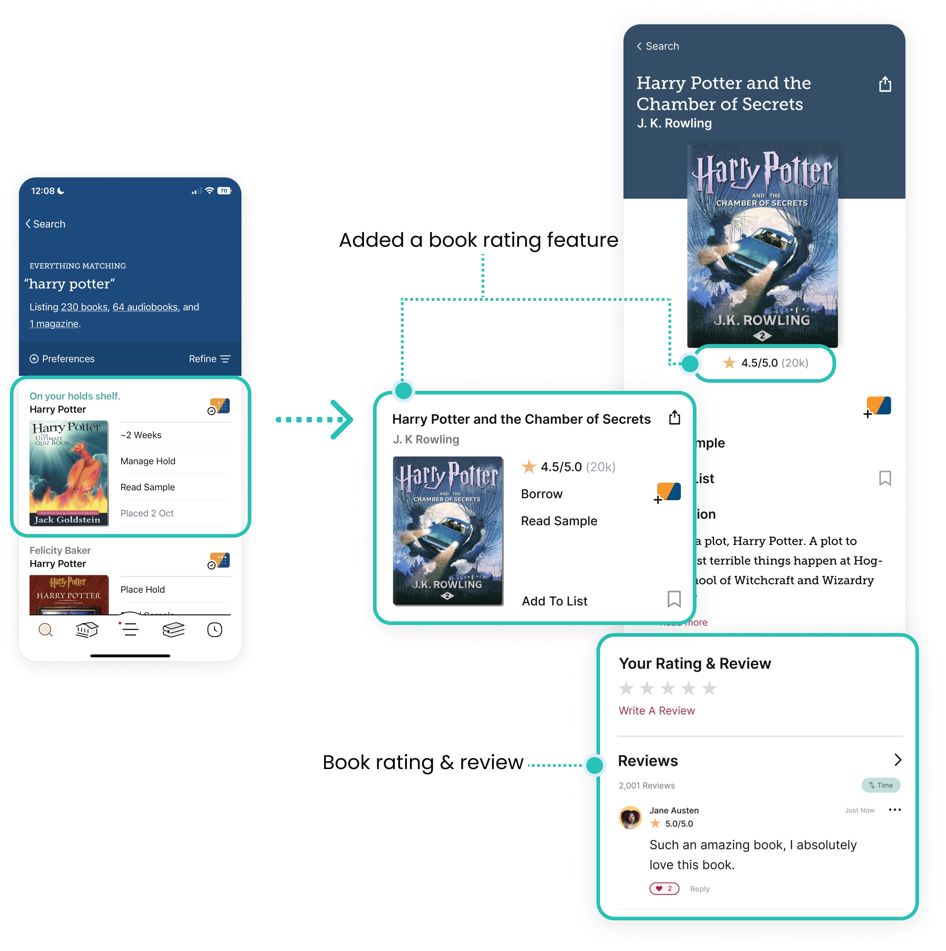
Lists feature
To improve user convenience and create a comfortable experience, I renamed Libby's list feature from "Tag" to "List".
I also redesigned it to be visually prominent, making it easier for users to locate and use.
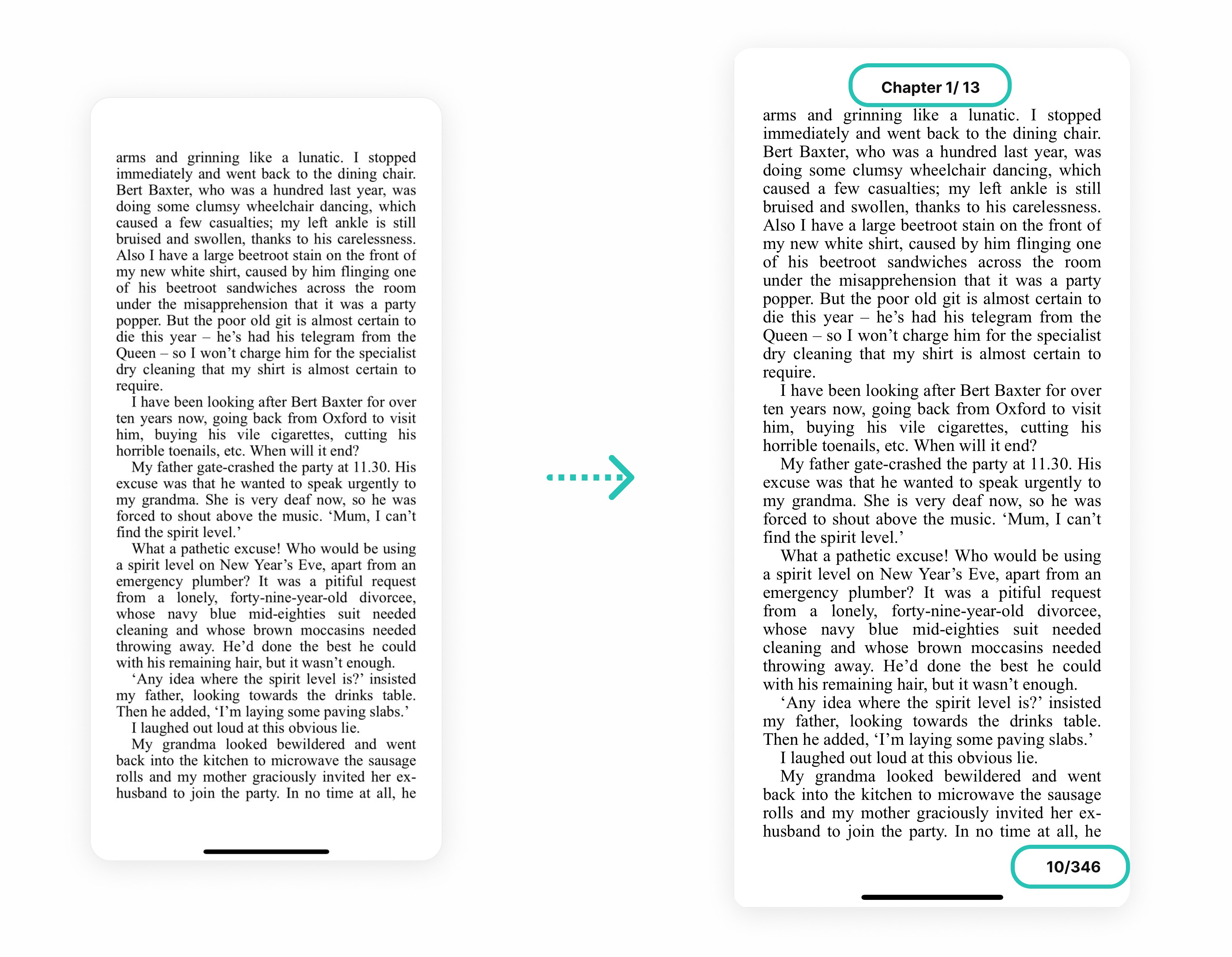
By including page numbers and chapter numbers, users can easily determine their position in the book and their reading progress.
High-fidelity design
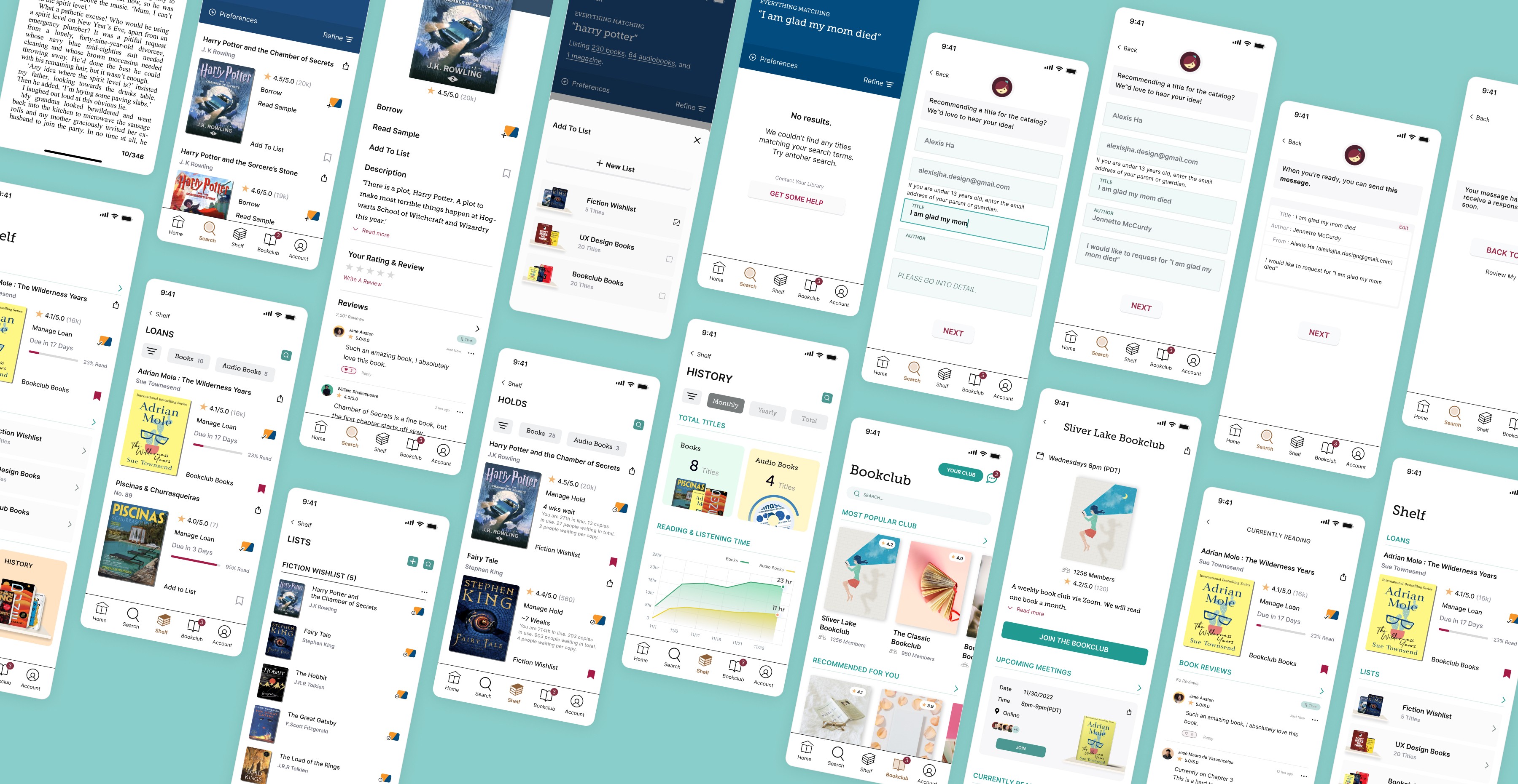
High-fidelity Prototype
TEST
Usablilty test
In order to assess the usability of the final prototype, I submitted my design to interviewees. I was pleased to learn that most users navigated the prototype with ease. The interviews also provided valuable feedback which helped me identify areas for improvement that would have otherwise been difficult to pinpoint.
REFLECTION
What I learned
The focus of this project has been on conducting user research and identifying their needs. Through interviews with users and analyzing app reviews on the App Stores, I have gathered a diverse range of perspectives and potential solutions. The insights gained from this process have been invaluable.
Next steps
The redesign of the Libby app was my first UX redesign project. Initially, I was overwhelmed by the sheer amount of information and work required. With the experience gained from this initial project, however, I am ready and eager to take on challenges in the future, including potentially a responsive website for Libby.

